Krux
Why this mattered
How I turned a nine-device accessibility audit into shipped wallet interactions and became a trusted design collaborator in an open-source Bitcoin project.
- Duration
- May–August 2026 (continuing contributor)
- Methods
- Accessibility Audit, Interaction Design, Firmware Prototyping, Device Testing
- Tools
- Figma, Python, GitHub, Krux Simulator, TZT Hardware

Overview — one of 50
3,272 people applied to Summer of Bitcoin 2026. Fifty were selected. I joined Krux in one of six designer placements, with a proposal to make a Bitcoin signing device easier to read and navigate without weakening the tasks it protects.
The programme gave me 12 weeks with an open-source product where a vague label or missed warning can affect real money. I expected to audit the interface and design a set of fixes. The work became more interesting than that. I had to learn when a measured failure deserved a firmware change, when a plausible idea should be closed, and how to help other contributors make interface decisions without claiming their implementation as mine.

That hardware range shaped every decision. The same interaction might have a touchscreen on one device, a physical-button sequence on another, and half the screen area on a third. I worked in Figma, firmware, simulator captures and a physical TZT rather than treating the mock-up as the final answer. The post-mnemonic design board shows how the common path was translated before it reached the release.
Context and background — one wallet, nine constraints
Krux is an open-source signing device for Bitcoin. It turns inexpensive, general-purpose hardware into an air-gapped tool for creating and loading wallets, reviewing transactions, and signing via QR codes. It supports nine targets rather than one controlled product shell.
The active displays span a 480 by 320 pixel touch interface on Amigo, a 320 by 240 display on TZT, and a 240 by 135 button-driven screen on M5StickV. Input methods, available colours, text capacity and viewing conditions change with the device. A global font increase that helps one target can break another. Adding one persistent menu row can cost several extra presses on minimal hardware.

There was another constraint: this was a live open-source project, not a student redesign waiting for a reveal. Maintainers owned the release, existing users already knew the flows, translations had to fit, and other contributors were changing nearby code. The right proposal had to improve the next decision without needlessly rewriting the product around it.
Design and development process — evidence changed the brief
My proposal began with readability and navigation. I turned that into four audit axes: colour contrast, text legibility, layout consistency and navigation clarity. I checked five themes and all nine supported devices, using Amigo, TZT and M5StickV as representative hardware tiers. The process and weekly decisions are published in the Krux accessibility record.
For contrast, I decoded Krux’s byte-swapped RGB565 colour constants, converted them to standard RGB, calculated relative luminance, and tested foreground and background pairs. The first strict pass found ten failures. For layout, a repeatable simulator sequence produced 354 screenshots across the three device tiers. I compared font metrics, line capacity, reserved regions and the steps needed to recover from a wrong choice.
The evidence narrowed the work. The screenshots did not support a global font change: the core type scale held up and the sampled flows had no critical clipping or overlap. The stronger issues were low-contrast theme pairs and screens that made people interpret a value or choose between equally weighted actions without enough context.
I already had one small contribution in the codebase before the programme. PR #853 corrected a settings label and merged on 7 May. It was useful proof that I could move between design, firmware and review, but I do not count it as an audit outcome.
How AI assisted the work — useful until the evidence disagreed
AI helped me work through an unfamiliar firmware codebase without pretending it understood the product better than its maintainers. I used it to map related code paths, compare small implementation options, surface edge cases and speed up repetitive work such as analysis scripts, test drafts and documentation.
I treated every response as a hypothesis. Before it influenced a design or pull request, I checked the source, ran focused and full tests, reviewed simulator captures and translations, and used maintainer or physical-device evidence when the decision required it. The reversals later in this story come from the same habit: any suggestion is disposable when the hardware or product context says otherwise.
AI-native means I can explore faster, but I still own the judgement and the proof.
Challenge 1 — A measurement was not the whole answer
The contrast audit found clear failures in the Light theme. Mainnet and testnet labels fell to 1.97:1 and 1.37:1 against the background. I changed the affected constants and added focused regression tests in PR #879. The pull request merged on 23 June with the full suite passing at 97% coverage.

One result did not survive contact with the device. A computed ratio suggested removing an Amigo information-panel override. On the physical display, that version looked worse. I restored the original behaviour and kept the finding hardware-gated.
That correction changed how I treated the audit. A ratio could locate a weak pair, but it could not see the panel, display quality and surrounding hierarchy together. Measurement started the review; it did not get the final vote.
Challenge 2 — A feature can fit and still be wrong
My first navigation direction added a Settings shortcut to Home. It fit. It reduced the immediate path to settings. It also reserved a permanent row for a task already available before a wallet was loaded.
Review on PR #894 exposed the cost more clearly than the mock-up did. Every common visit to Home would carry that extra choice, while the benefit appeared only in a narrower state. I closed the pull request on 3 July.
Closing it was part of the design work. The implementation proved feasibility; the review proved it did not deserve recurring attention. I documented the decision and moved on instead of defending the time already spent.
Challenge 3 — Make the common action obvious
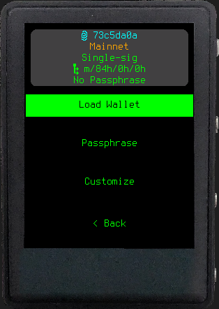
After generating a mnemonic, Krux showed Load Wallet, Passphrase,
Customize and Back at the same level. All four actions were valid, but only
one continued the normal setup. A first-time user had to infer which specialist
options could be skipped at the moment when the wallet summary needed their
full attention.
I kept the summary and changed the hierarchy. Continue became the first
action. Passphrase and Customize moved under Wallet Options, while Back
remained available. Loading an existing mnemonic kept its established menu,
which limited the change to the newly generated path.
Before — equal-weight actions
After — Continue first
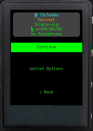
The Figma board covered all three device tiers before I changed firmware. Simulator checks then covered the common path, Back and decline recovery, nested options and the longest French translation. A physical TZT check caught the parts a static frame could not: focus order, button presses and return paths.
PR #909 is recorded as closed
rather than GitHub-merged. Maintainers rebased and integrated the work into
develop, then extracted shared menu code in a follow-up commit. The change
shipped in Krux v26.08.0,
so I describe it as integrated and released, not merged.
Design collaboration — trust expanded beyond my PRs
By then, contributors were asking me to review interface work outside my own pull requests. The clearest example was the QR scan action for the on-screen keypad in PR #811.
I was invited to work on the keypad layout, user flow, QR glyph and device
testing. The final direction uses one recognisable pixel motif, places it in an
unused symbol cell, and returns scanned text to an editable buffer instead of
triggering Go. That last decision matters in a signing tool: scanning should
not silently commit the next action. The implementation remains the original
author’s work. My four co-authored commits record the design and testing slice.

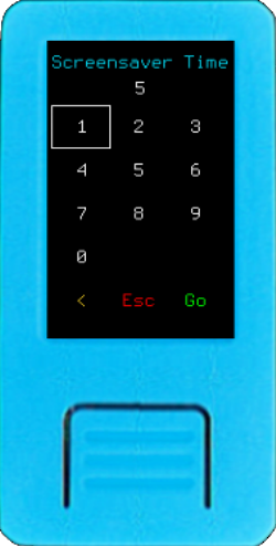
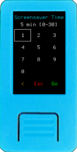
Two more threads show how the role expanded. For numeric settings, the current editor displayed a bare value. My Figma comparison put the selected value, unit and accepted range above the existing keypad. In PR #911, I carried that design into firmware with length-aware fallbacks for M5StickV. Stored values, validation, defaults and keypad geometry did not change.
Before — value only
After — value, unit, and accepted range
The other thread is recovery. The current workflow asks for a mnemonic length before it knows whether the user wants words, QR input or another format. My format-first recovery study moves that decision earlier, then shows only the settings relevant to the chosen format. PR #922 remains an open Draft with passing checks, so I present it as active implementation rather than an outcome. See the live pull request.
As verified on 13 August 2026, PR #811 is an open Draft; PR #911 is open and
non-Draft after positive maintainer reviews, a rebase onto the current
develop branch, and passing checks; and PR #922 is an open Draft with passing
checks. Status labels matter here. A polished board is not a release, and a
passing pull request still belongs to the review process.
Results and impact — shipped, integrated, and still in review
The shipped record is specific. PR #853 and the audit-led contrast PR #879 merged. The post-mnemonic hierarchy from PR #909 was integrated after a maintainer rebase and released in v26.08.0. The release notes include special thanks to me and reference my UI studies, but I do not turn that acknowledgement into a formal leadership title.
The work in review is just as useful to show because it reveals the boundary
between design intent and project ownership. The QR keypad collaboration has
co-author credit and device evidence. Numeric context has a working firmware
implementation, positive maintainer reviews, a rebase onto the current
develop branch, passing checks and physical TZT verification. Format-first
recovery has a documented interaction model, a Draft implementation and
passing checks. None of those should be described as shipped yet.
The audit also produced a result that is easy to miss in a portfolio: evidence against redesign. Across 354 screenshots, the base type scale and sampled layouts did not show the critical failures I expected. That let me spend the programme on the places where a change earned its cost.
Reflection and takeaway — change less, prove more
I arrived with a proposal about accessibility. I left with a better way to make decisions in security-sensitive products. Find the failure with a repeatable method. Check it on the constrained device. Keep the implementation boundary small enough to review. Be precise about what merged, what maintainers integrated, and what is still waiting.
The moments I am proudest of are not the biggest-looking screens. They are the Amigo change I reversed after hardware evidence, the Settings shortcut I closed after review, and the scanned keypad value that remains editable. Each one required me to let evidence overrule a neat design story.
That is the lesson I will carry forward: in a system that protects money, better design often means change less, prove more, and make the next decision clearer.
Read the full public audit and weekly record or see the official Summer of Bitcoin 2026 selection announcement.