Case Study
Selected as 1 of 30 for Apple's Foundation Program. Shipped an iOS emotion-mapping app in 3 weeks.
Role
Designer + Developer
Duration
3 weeks, 2025
Methods
Design Sprint, Rapid Prototyping, Collaborative Ideation
Tools
Figma, Xcode, SwiftUI, FigJam
Lumo, iOS Emotion Exploration App
The Program
In October 2025, I was selected as one of 30 students across the University of Technology Sydney for the Apple Foundation Program. The program runs for three weeks, full-time, 9:30am to 2pm every day. Apple provides the methodology. Your team finds the problem and builds the solution.
I joined Team i5 Pro with four others: Ina Song, Jihee Lee (Joy), Peter (Quang Tu Nguyen), and Patrick Zaw. We had three weeks total, but only five days of actual coding. The rest was research, design thinking, prototyping, and iteration.
My role spanned design and development. I worked on UI design in Figma, wrote SwiftUI code in Xcode, and helped coordinate across the team. By the end, we shipped Lumo.
Praised by Apple VP Lisa Jackson
Apple's VP of Environment, Policy, and Social Initiatives visited two teams out of all the groups. Ours was one of them. After seeing the prototype, she said she wanted to use it right away.
Working iOS app in 5 days of code
From blank Xcode project to a functional SwiftUI app with 196 interactive emotion bubbles, animated visualisations, and a complete user flow. Three weeks of design thinking, five days of implementation.
Design, code, and coordination
I contributed across the full stack: UI design in Figma, SwiftUI implementation in Xcode, and day-to-day coordination across five team members.
The Problem Space
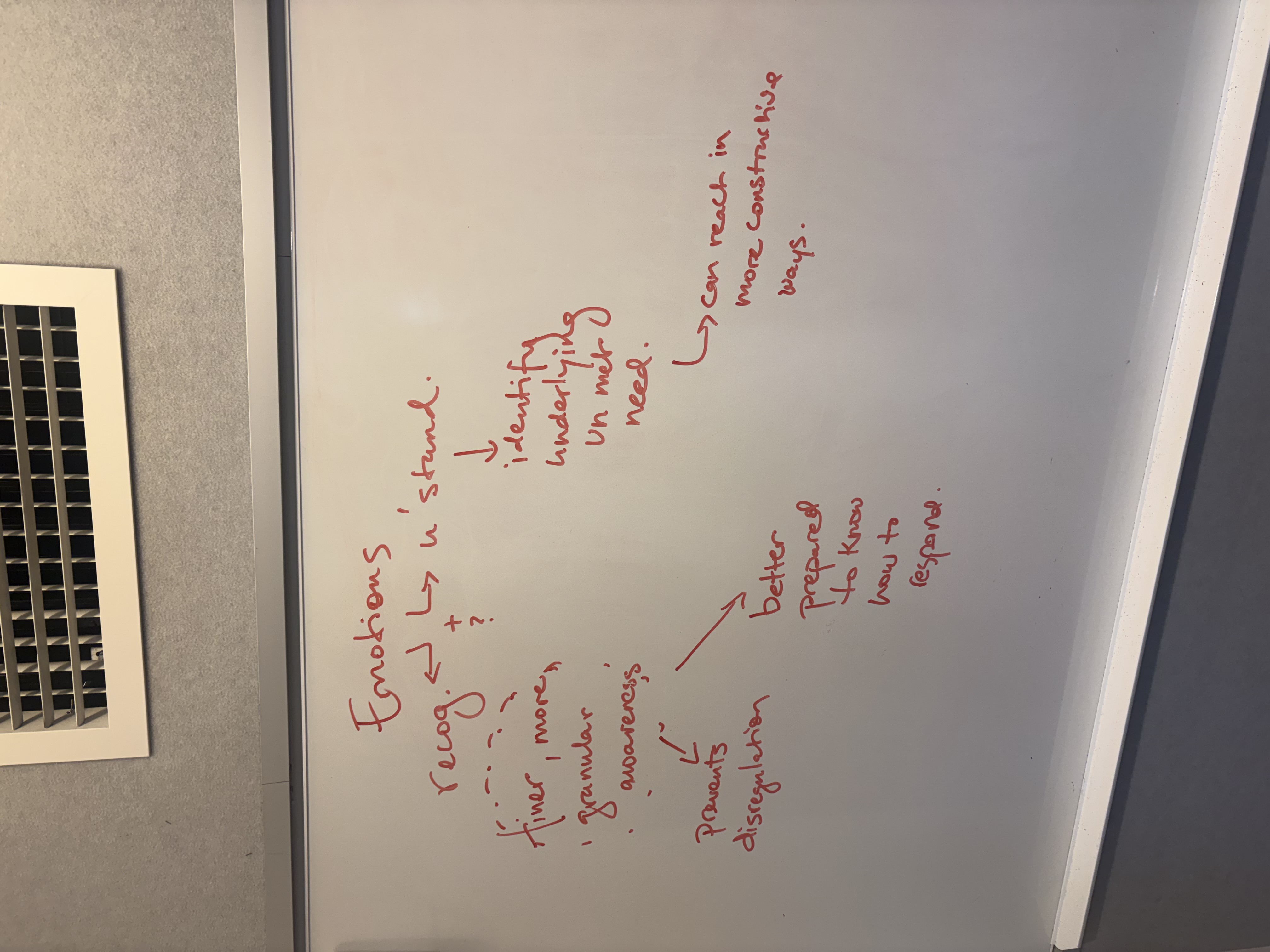
The first week was pure design thinking. No screens, no code. Our team theme was health, and through Big Idea Collaborative Mapping we kept narrowing it: from health, to emotional health, to a single concept we could actually build around: emotion. From there Apple’s framework pushed us onto a single Essential Question: why is it important to recognise our emotions?
That question became our first Challenge Statement: help people recognise their emotions. It was a starting point, not the destination.
We kept circling back to a distinction that changed how we thought about the project: the difference between an emotion and a feeling. An emotion is an unconscious reaction: your heart races, your stomach drops, your jaw clenches. A feeling is the conscious interpretation of that reaction: the moment you recognise “I’m anxious” and start thinking clearly about what to do next.
Neuroscience backs this up. Research shows that when you can name your exact emotion, the brain’s emotional alarm system quiets down and the logical thinking part activates. The act of labelling is itself the intervention.
We pinned everything we’d learned onto a Findings Wall and tried to synthesise it. Three words kept separating out from the noise: emotion, recognition, feeling. The Refined Challenge wrote itself: help people turn emotions into feelings.
Research
We interviewed startup founders about how their own concepts had evolved once real customers got hold of them. Most had shipped something narrower than their first pitch. Most had been surprised by which features people actually came back for. That shaped how tightly we were willing to scope Lumo: we started cutting things we thought we wanted, and the product got sharper every time we did.
Before we could recruit actual 18 to 24 year olds at scale, we used agentic AI tools to build live personas of that cohort and had real conversations with them. We ran objection-style interviews, asked how the first few months of full-time work had actually felt, and tested whether our framing landed. It let us stress test the problem statement before week one ended, with faster turnaround than any recruiting pipeline could have given us.
We ran our sharpest user interviews with people who didn't exist yet. Agentic personas let us rehearse the conversations before we had to have them for real.
Who we designed for
Our Domain Persona was specific: 18 to 24 year old early-career professionals in the first years of full-time work. High daily emotional load, low vocabulary for naming what they were feeling, comfortable on an iPhone, sceptical of wellness apps that ask for too much. That cohort produced the Problem/Opportunity Statement we carried into design: they need a guided way to recognise emotions because they need better emotional awareness and control.
Design Decisions
With the challenge and the persona locked, we let ourselves start designing.
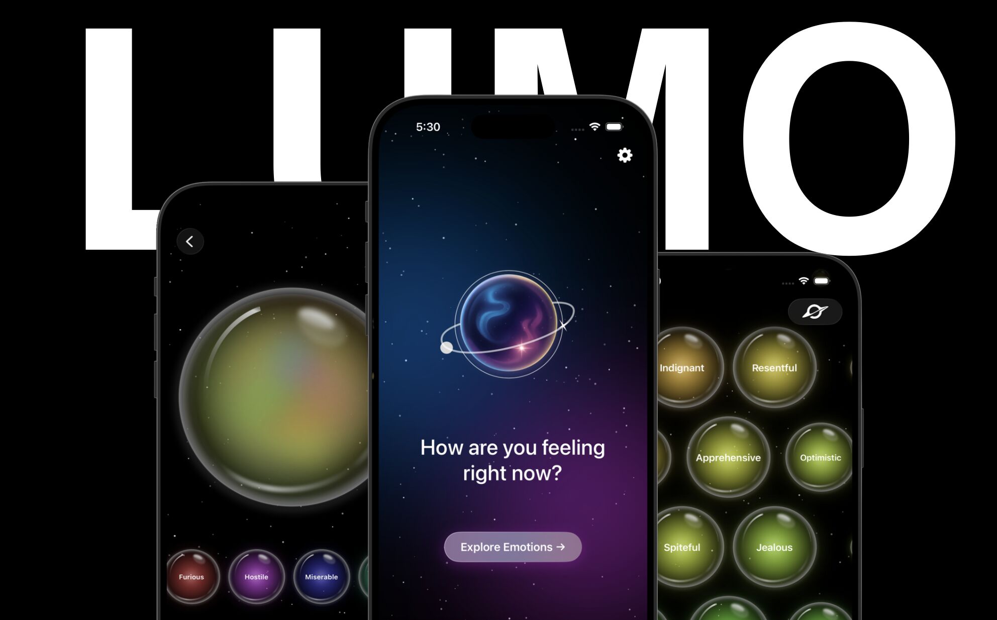
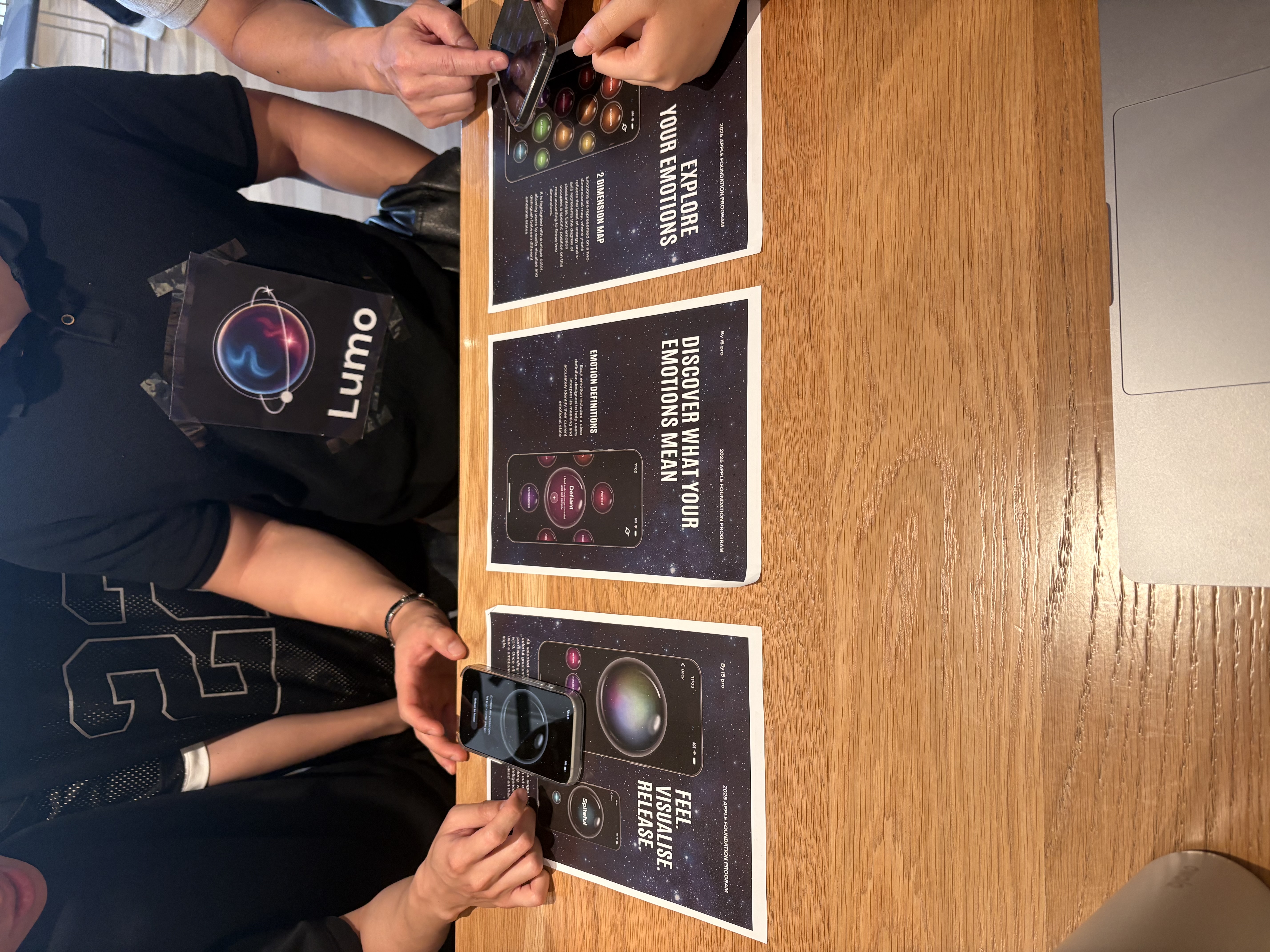
Psychologist James Russell mapped emotions on two axes: valence (pleasant to unpleasant) and arousal (calm to intense). This creates a 2D space where 196 distinct emotions each have a position. We saw an opportunity: if emotions have a spatial relationship, they can be explored spatially.
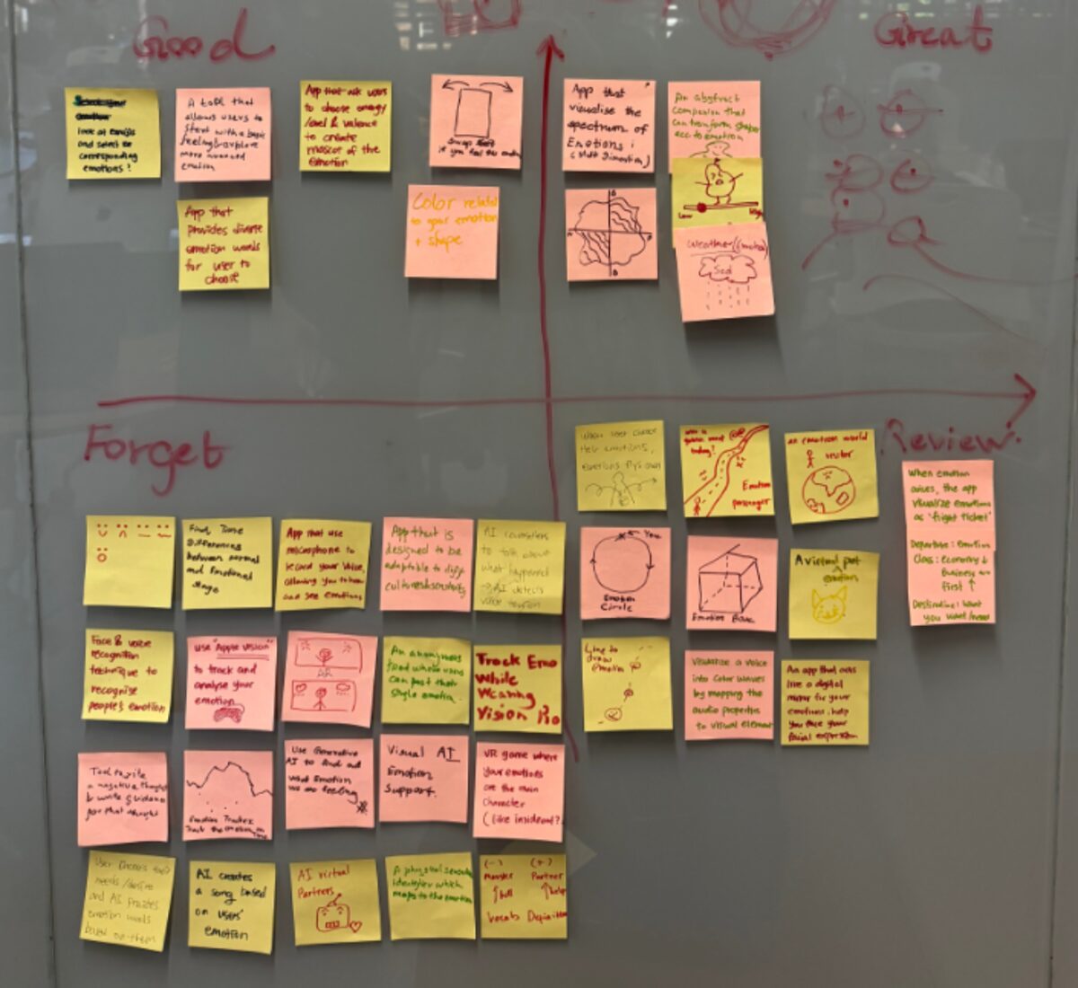
We debated how to present 196 emotions. A scrollable list would strip out the spatial relationships that make the model useful. An emotion wheel would look familiar but flatten nuance by compressing everything into a circle. We chose a 2D grid.
Each emotion is rendered as an interactive bubble, colour-coded by its position in the valence-arousal space. Reds and purples sit in the high-arousal, low-valence corner (anger, anxiety). Greens and teals occupy the calm, pleasant zone (peace, contentment). The colours aren’t decorative. They encode emotional tone, so users can navigate by feel before they find the right word.
The bubbles scale dynamically based on proximity to the centre of the screen. Whatever emotion you focus on grows larger while surrounding emotions remain visible as context. Tap to select, and you can hold up to eight emotions at once.
A mentor told us early on: “Simplicity is focus.” We kept coming back to that. The interaction had to feel like exploration, not data entry.
When you can label your emotion, it becomes a feeling. The grid makes that labelling possible for people who don't have the vocabulary yet.
What We Built
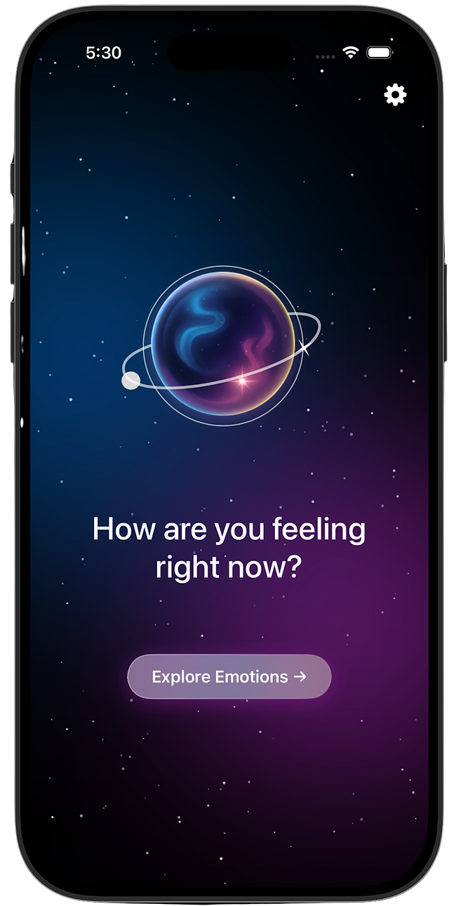
Lumo guides users through a simple flow: land, explore, confirm, and visualise. The whole experience loops in under two minutes.
Explore
The heart of Lumo. A 14x14 grid of 196 emotions, each rendered as a coloured bubble against a cosmic starfield. Users scroll and tap to select the emotions they are feeling right now. The colours encode emotional valence and arousal, so users can navigate by feel before they find the right word. Each bubble scales dynamically based on proximity to the screen centre. Tapping a bubble reveals a plain-language explanation of that emotion.
The grid makes the invisible visible. Users don't need emotional vocabulary to start. They just tap what resonates.
Visualise and Release
After selecting emotions, users hit Release and Lumo blends them into a single animated bubble. The colours mix. The bubble breathes. Selected emotion labels appear as draggable pills below, each one a small coloured orb you can interact with. The end screen offers a gentle affirmation: 'Feelings are just visitors, let them come and go.' The act of visualising and releasing is the moment where recognition becomes regulation.
We wanted the result to feel alive, not clinical. Getting the bubble animation and haptics right in SwiftUI was the hardest technical challenge of the project.
Landing and Daily Practice
The landing screen asks one question: How are you feeling right now? No onboarding flow, no account creation, no friction. One tap starts the exploration. Users can set daily reminders for emotional check-ins at morning, afternoon, and evening, turning a single-use tool into a daily practice of emotional awareness.
We stripped everything that wasn't the core loop. Five days of coding forces clarity about what actually matters.
What I Contributed
Design. I worked on UI design in Figma, including the emotion grid layout, the colour mapping system that encodes valence and arousal, screen flows, and the visual language (cosmic theme, starfield backgrounds, iridescent bubble effects).
Code. I wrote SwiftUI views and worked on implementing app features in Xcode. I had no prior Swift experience before this program. I learned by building, picking up Apple’s Human Interface Guidelines and SwiftUI patterns as the project demanded.
Coordination. With five people and three weeks, someone had to keep the timeline honest. I helped run standups, managed task allocation, and kept design and development in sync across the team.
What I Learned
Three weeks total, five days of coding. That constraint changed how I think about scope. We cut a journaling feature, a social sharing flow, and a detailed emotion history view. What survived was the core loop: explore, confirm, visualise, release. Our mentors kept reminding us: “A good solution solves one thing really well.”
Learning SwiftUI from scratch while shipping a product was uncomfortable, but discomfort is where the growth happens. By the end, I was reading Apple’s Human Interface Guidelines not as a reference document but as a design philosophy.
The Apple Foundation Program taught me something I keep coming back to: good ideas are everywhere. Shipping them in three weeks, with a team you just met, under Apple’s standards, is the hard part. That’s the part that matters.