Case Study
Universities teach theory. Workplaces demand practice. I designed what goes in between.
Role
UX Researcher + Designer
Duration
4 months, 2025
Methods
User Interviews, Usability Testing, Lean UX, Participatory Design
Tools
Figma, Miro, Notion, Agentic AI Tools
SkillBridge, Skill Analyser Platform
The Brief
Two UTS research professors, Dr. Franziska Trede and Dr. Simon Buckingham Shum, had been studying the same problem for years: work-integrated learning students could pass exams but froze in real professional situations. They fumbled feedback conversations, struggled through stakeholder presentations, and had no framework for the interpersonal side of work.
Our team was tasked with designing a platform connecting students, professors, and employers. A core requirement: AI had to function as a learning partner, not a replacement for human educators. I led research and design across all five sprints.
Workplace Simulator had no equivalent
Stakeholders identified it as the primary differentiator. No existing WIL platform offered structured practice for interpersonal professional skills.
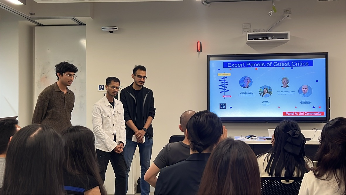
Endorsed for further development
The concept received endorsement for further development within UTS research initiatives after presenting to academic leads and industry professionals.
Feedback Gallery eliminated scattered channels
Academic supervisors noted it would consolidate feedback they were already giving across email, Slack, and hallway conversations.
What We Walked Into
I started broad, interviewing WIL students, academic supervisors, and industry mentors to map where the breakdowns actually happen.
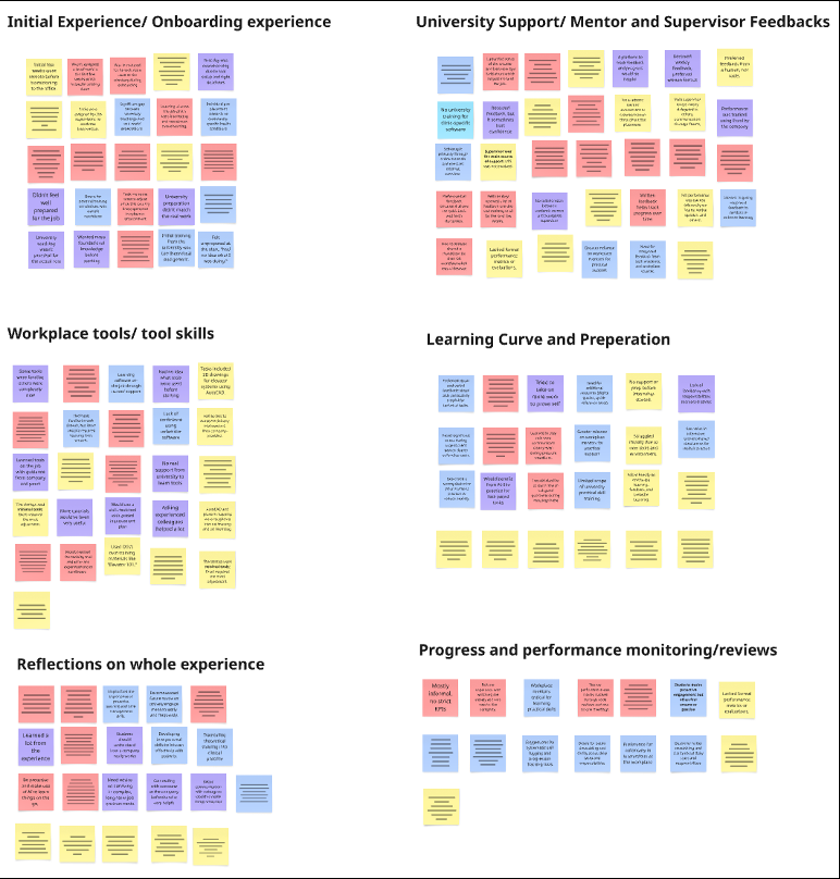
Three patterns surfaced quickly:
Students didn’t know what they didn’t know. Most could spot technical gaps (specific software, tools) but had no way to recognise softer professional gaps: stakeholder communication, adaptability, handling ambiguity.
Feedback was scattered across channels. Academic feedback lived in the LMS. Workplace feedback came via email, Slack, or hallway conversations. Students had no single view of how they were actually progressing.
There was no safe space to practise. Students went from theory to placement with zero opportunity to rehearse the messy, interpersonal side of professional work.
There are a lot of charts and numbers in the dashboard, but I'm struggling to quickly understand how well I'm doing overall.
The Part That Got Messy
Our first brainstorm was a disaster. Teammates showed up late. We couldn’t find an empty room. When we finally started, everyone had their own big idea and nobody wanted to let go. Decision paralysis hit hard.
I introduced Dot Voting to break the deadlock: everyone generates ideas independently, then the group votes to prioritize. It worked. We went from circling to converging in one session.
Then we lost a team member mid-project. The workload shifted. I stepped into a project management role alongside design: setting up Trello boards, redistributing tasks, keeping us on track through the final sprints. It wasn’t glamorous work, but it was the work that kept the project alive.
The Pivot
We ran five Lean UX sprints over four months, testing prototypes with real students and supervisors after each cycle. The early sprints were rough.
Our first concept tried to serve all three stakeholders equally: students, professors, employers. It ended up serving none of them well. User testing made this obvious. The interface was a compromise, and everyone felt like the platform wasn’t really for them.
After sprint two, I pushed to narrow the primary user to students, with professors and employers feeding structured data into the system rather than using it as a daily tool. That decision unlocked everything.
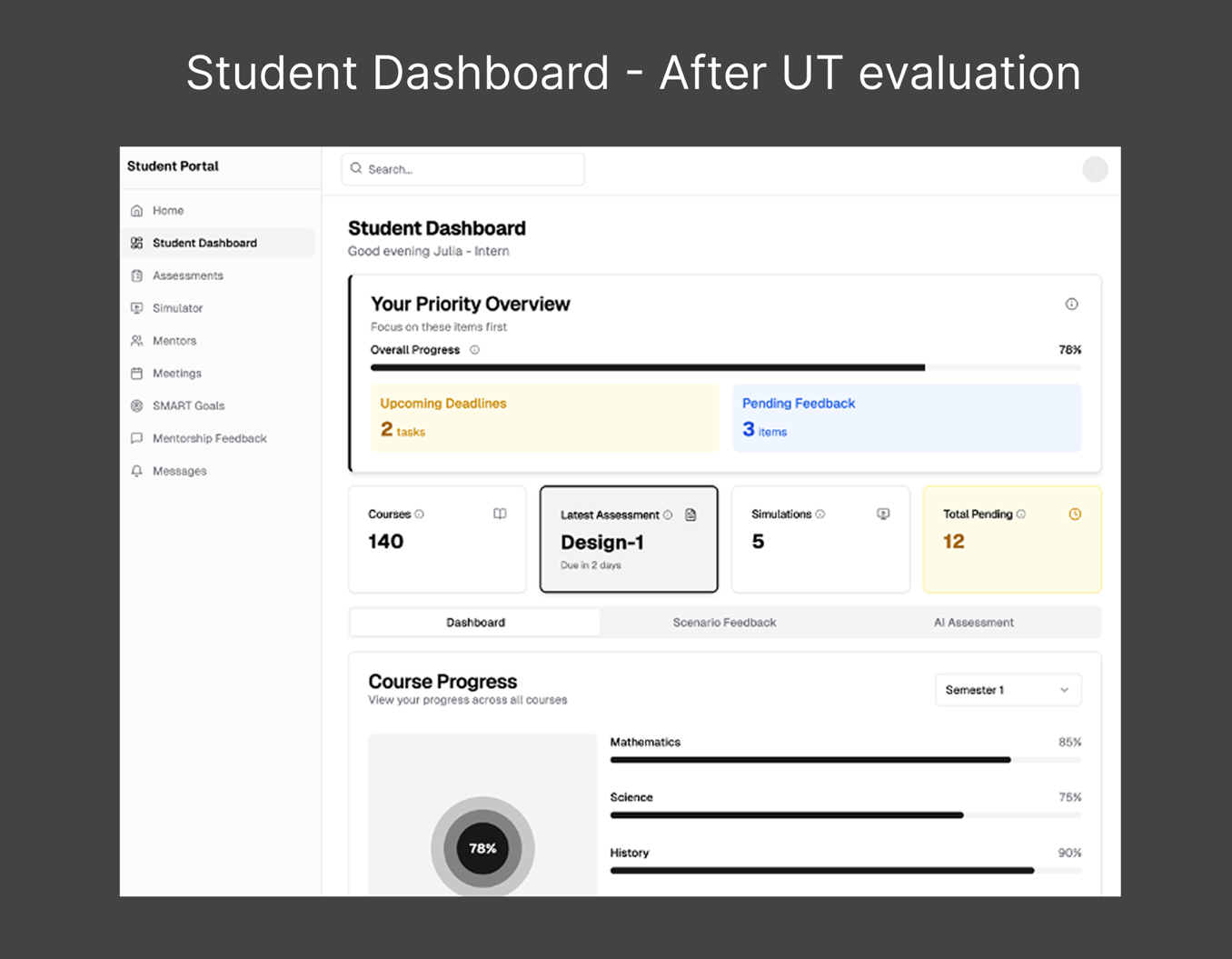
Mid-fi dashboard with 8 nav items: Assessments, Simulator, Mentors, Meetings, SMART Goals, Mentorship Feedback, Messages. Trying to serve everyone at once.
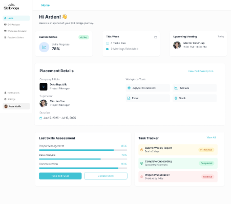
Student-first platform. Four clear features: Skill Analyser, Workplace Simulator, Feedback Gallery, and AI Mentor. Professors and employers feed data in, students use the tool.
What We Built
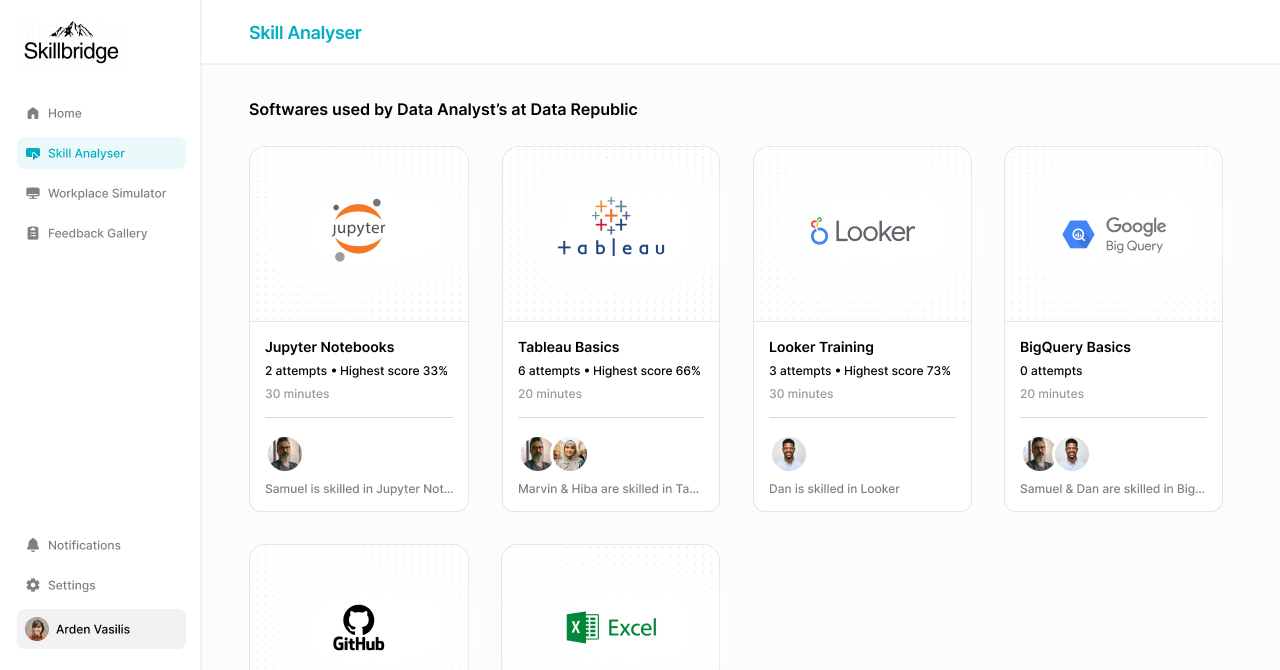
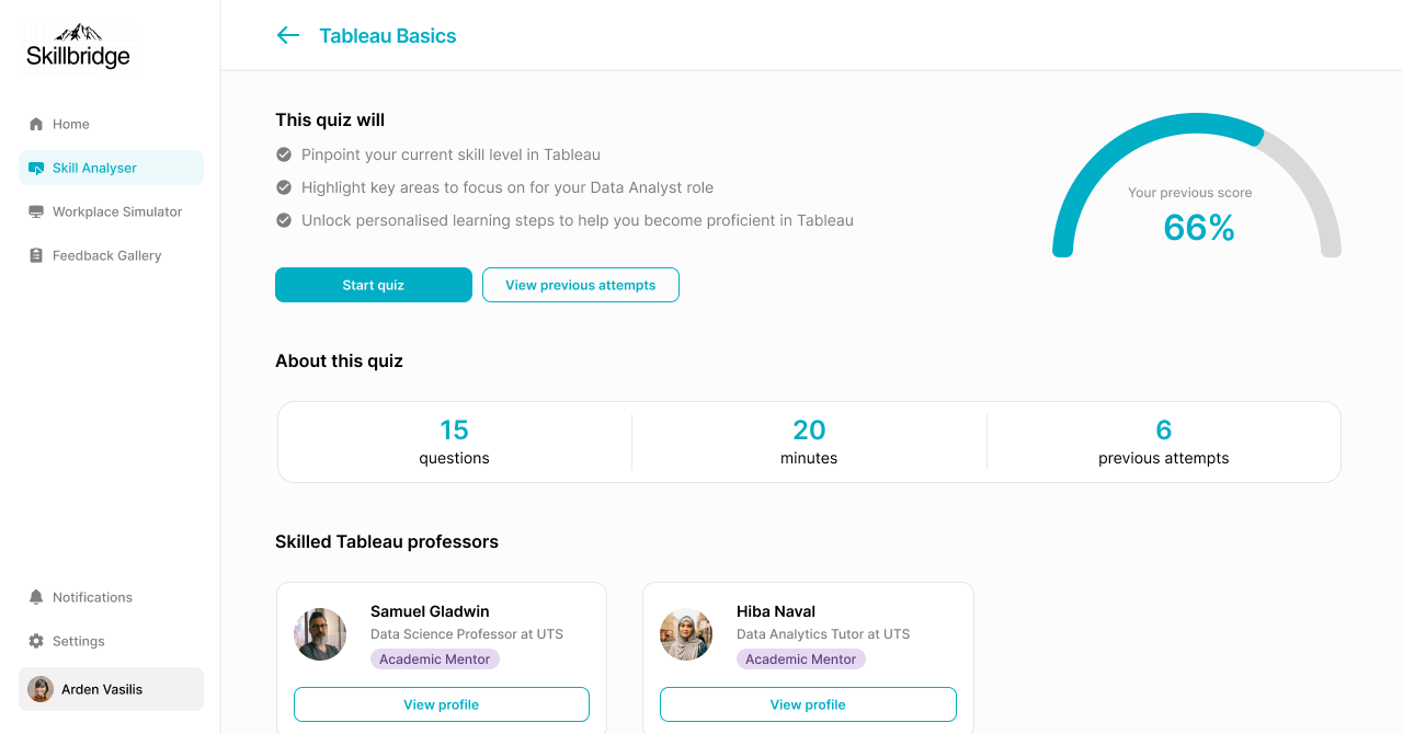
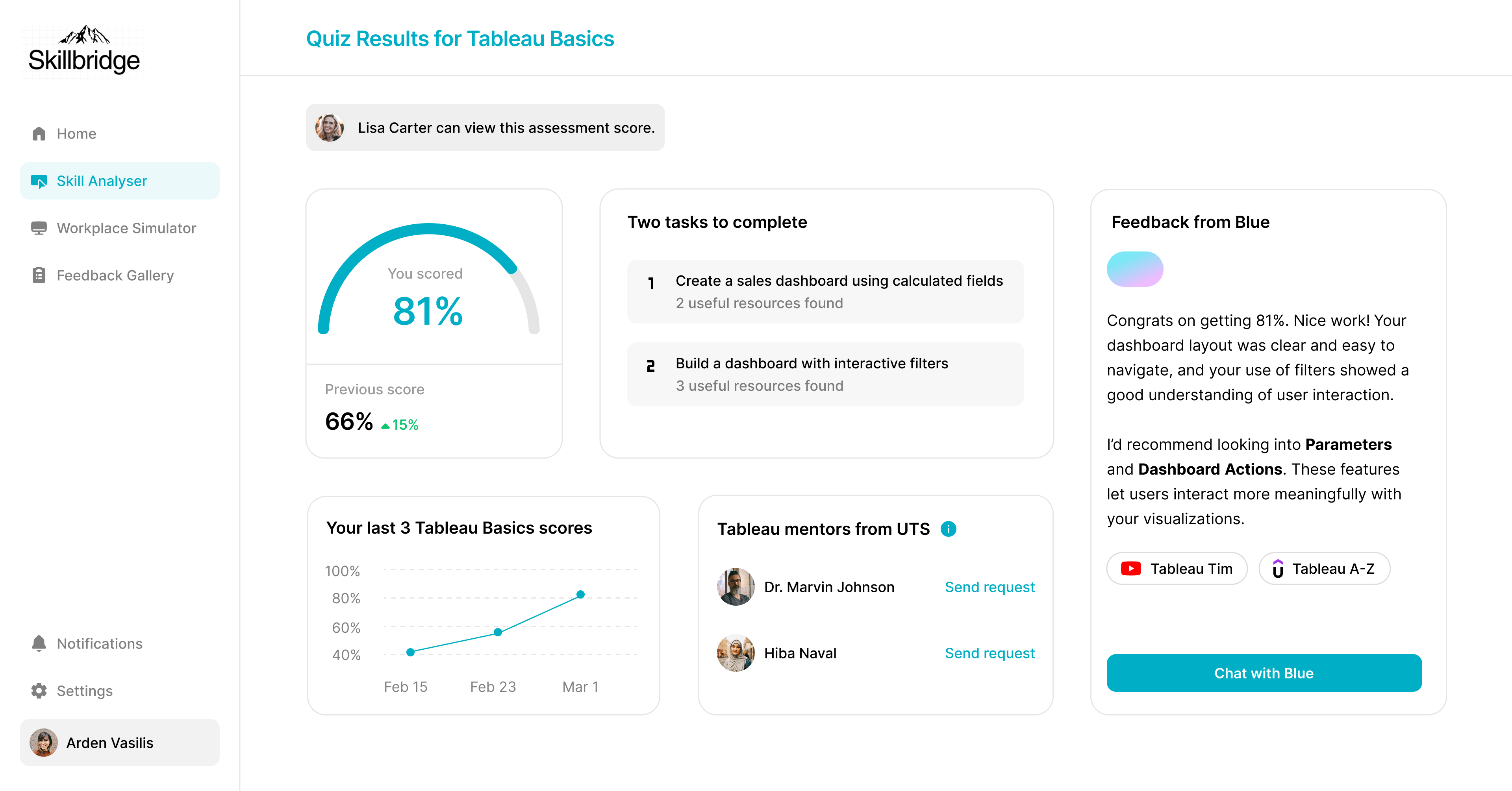
Skill Analyser
SkillBridge begins with a role-specific software assessment mapped to the student's actual WIL placement. A data analytics intern gets assessed on Tableau and SQL. A marketing intern gets assessed on campaign platforms. No generic 'problem-solving' quizzes. Each assessment tracks attempts, highest scores, and connects students with mentors who are skilled in that tool.
Role-specific, not generic. The assessment mirrors what they'll face on day one.

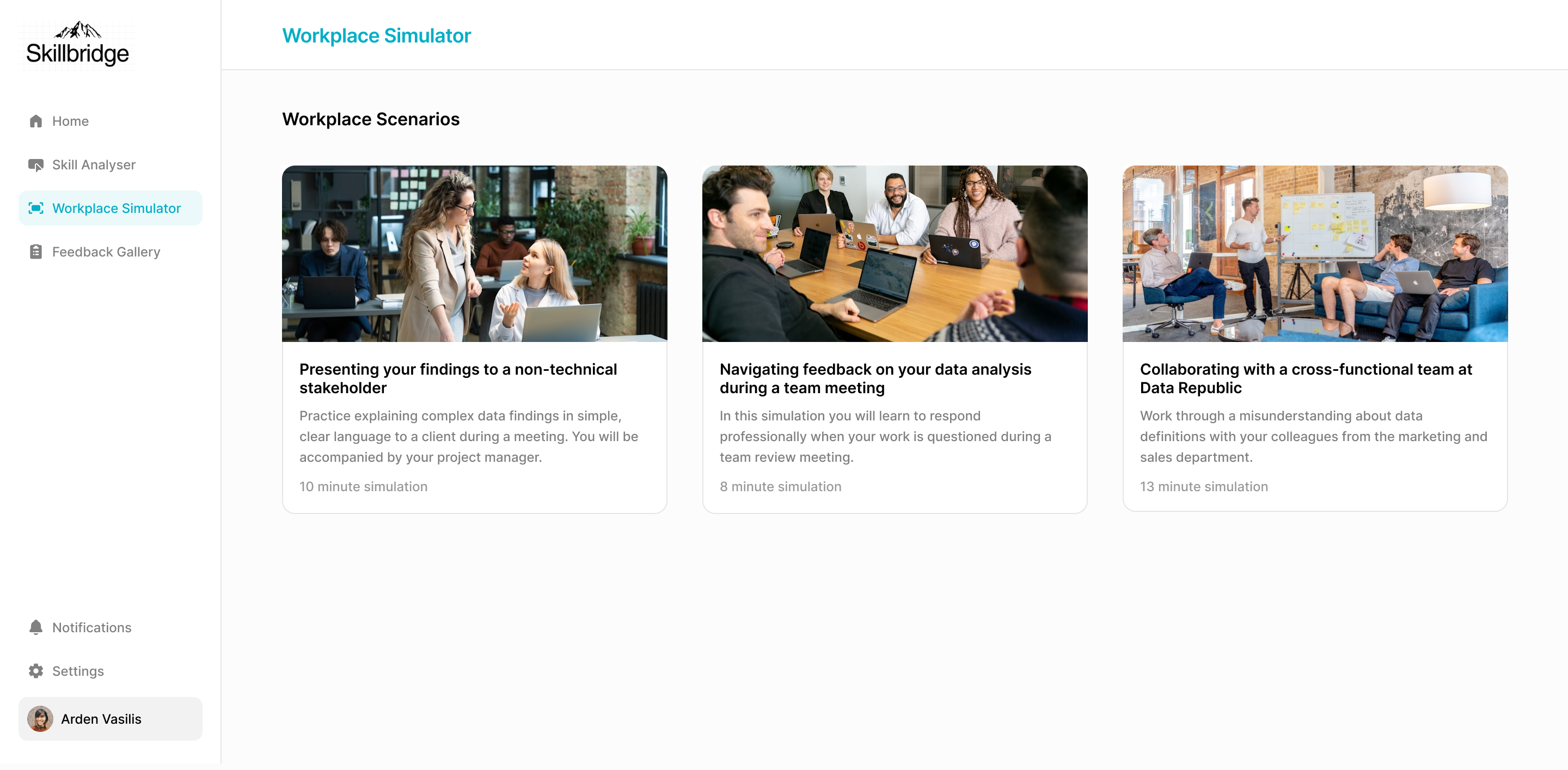
Workplace Simulator
The feature that changed the project's direction. Scenario-based sessions where students navigate realistic professional situations: presenting findings to a non-technical stakeholder, handling critical feedback in a team meeting, collaborating cross-functionally under time pressure. Each scenario is timed, role-specific, and maps to key professional competencies.
No existing WIL platform offered structured practice for interpersonal professional skills. This was the gap nobody else was solving.

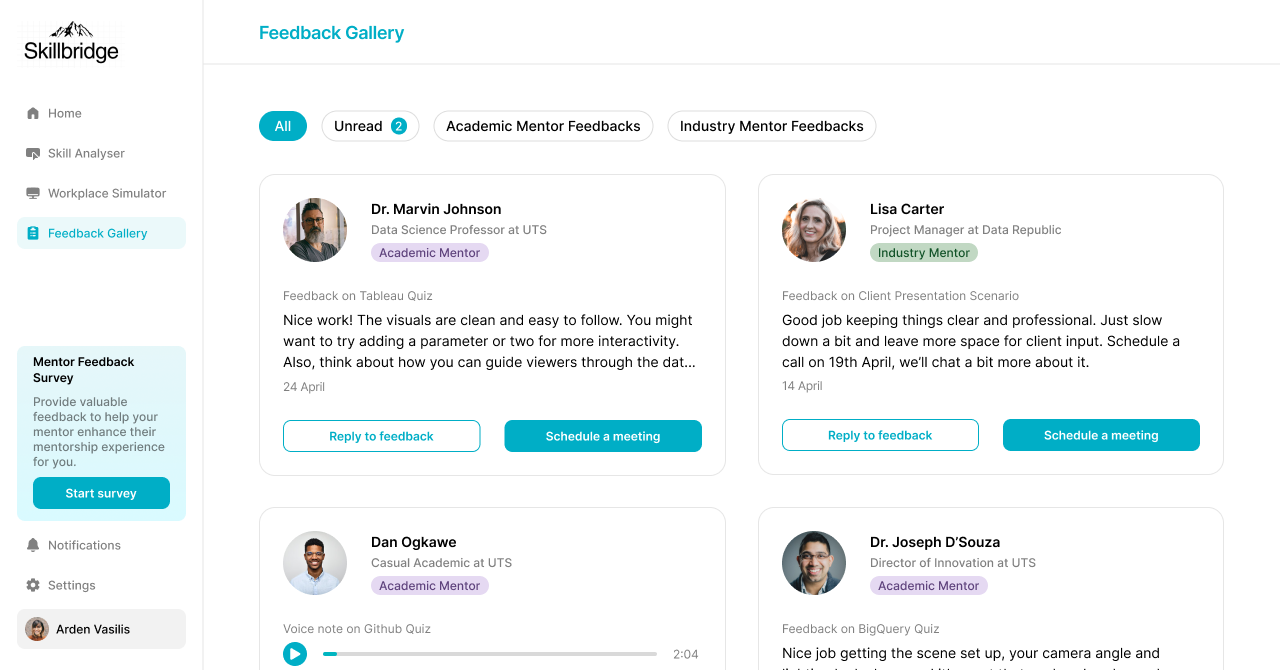
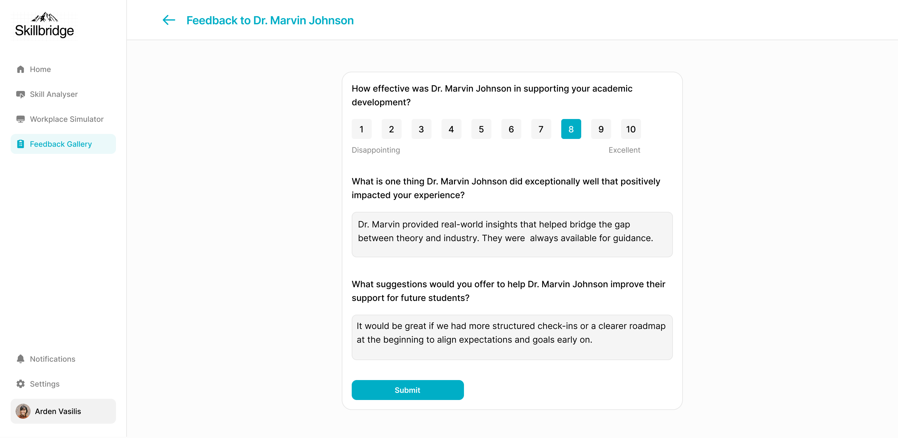
Feedback Gallery
Structured feedback from both academic and workplace supervisors, collected through guided forms designed to eliminate vague responses. Every piece of feedback maps directly to a completed assessment or simulation, so students can trace exactly what they did to what was observed.
One place. Transparent. Trackable. No more digging through email threads.
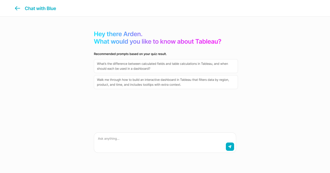
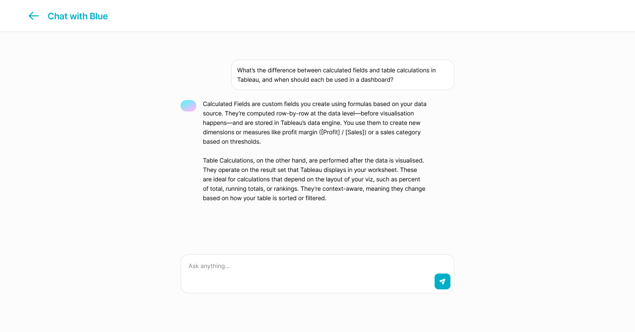
AI Mentor: Blue
An in-platform AI assistant that adapts to each student's assessment results and skill gaps. Blue doesn't lecture. It asks questions, surfaces relevant resources, and helps students reflect on their simulator performance. Every prompt is contextual, based on what the student has actually done on the platform.
AI as a thinking partner, not an answer machine.
Final MVP walkthrough: onboarding, Skill Analyser, Workplace Simulator, Feedback Gallery, and Blue.
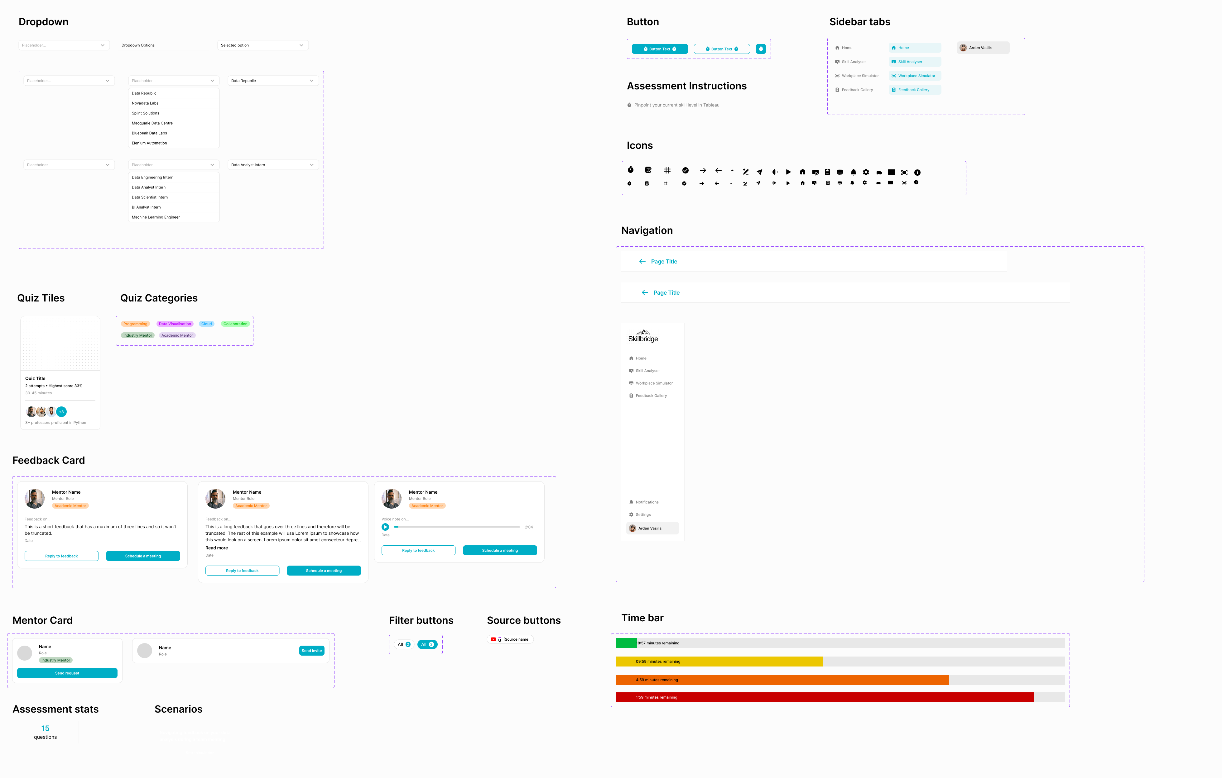
Design System
A component library I built in Figma underpinning every surface of the platform. Dropdowns, cards, navigation patterns, and assessment visualisations, all documented to ensure visual consistency and faster iteration as the design evolved across sprints.
What I’d Do Differently
If I ran this again, I’d push for more structured documentation from sprint one. Lean UX’s minimal documentation approach worked for speed, but it cost us shared understanding, especially after losing a team member. Key decisions lived in people’s heads instead of on paper.
I’d also time the competitive analysis differently. I did extensive market research in sprint one before we’d fully defined our problem statement. The research was useful eventually, but it would have landed harder if we’d locked in the user problem first.
These aren’t regrets. They’re the kind of lessons you only learn by doing the work.
What Came Next
SkillBridge ended, but the problem stayed with me. I spent the next five months turning the questions this project raised into a formal graduate research thesis: evaluating how existing platforms like Forage and Springpod handle the tension between scaffolding and realism.
I ran heuristic evaluations, usability tests with early-career users, System Usability Scale scoring, and think-aloud analysis. The research formalized patterns we had intuited during SkillBridge into named concepts: the “Scaffolding Paradox” (platforms designed for ease of use accidentally making users passive), the “Role-Congruence Gap” (novice and expert users needing fundamentally different levels of realism), and “Productive Friction” as a design principle (friction is a feature in simulation, not a failure).
Looking back, the design decisions we made on SkillBridge held up under academic scrutiny. The Workplace Simulator introduced productive friction. The Skill Analyser addressed role-congruence. Blue provided diegetic support instead of generic help popups. We had solved for these problems before I had the language to name them.
The thesis received a High Distinction and is being prepared for conference and journal submission later this year.