Case Study
A 48-hour designathon sprint that won People's Choice. A 'Spotify Wrapped' for your social media algorithm.
Role
Research Lead + Product Designer
Duration
48 hours, 2025
Methods
Primary Research, Affinity Mapping, Rapid Prototyping, A/B Testing
Tools
Figma, Rapidata
The Designathon
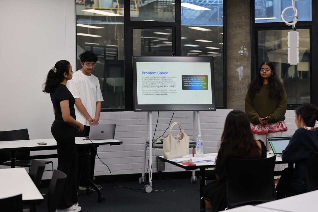
I teamed with four classmates, Vijaya, Kavya, Shraddha, and Supriya, for the SUEDE Designathon as Group 27. The brief arrived on a Friday, presentations went up on a Sunday. Forty eight hours. Dozens of teams. One trophy that mattered.
We won it with Algo.
My role was research lead. I also contributed across brand, hi fi design, and the pitch. With five people and forty eight hours, everyone touched everything. My anchor was making sure the product stood on evidence.
Voted the strongest idea in the room
SUEDE's People's Choice Award is decided by the other competing teams, not the judges. Out of all the groups in the designathon, Group 27 was the one our peers said they wanted to use.
21 interviews and 20+ surveys in 48 hours
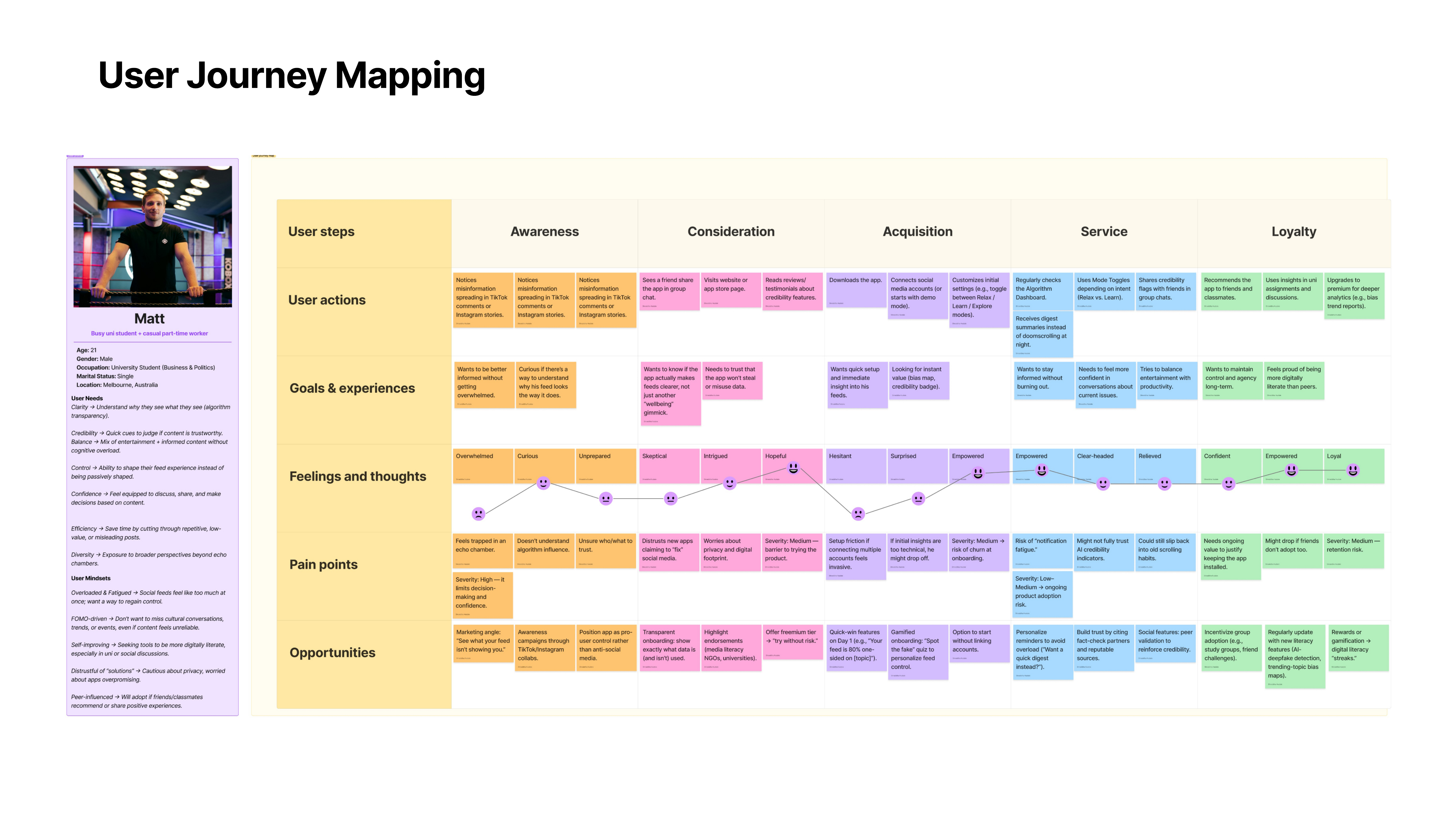
I led a primary research sprint that ran speed interviews at the venue itself, synthesised via a live affinity map, and produced a grounded persona and problem statement by Saturday afternoon.
Brand, design system, and hi fi prototype from scratch
End to end visual identity, a component kit, a full onboarding flow, and a Wrapped story experience. Everything built inside the clock. Nothing reused from a template.
The Problem Space
Young Australians are drowning in algorithms they cannot see. Forty six percent of eighteen to twenty four year olds now treat social media as their primary source of news, up from twenty eight percent the year before. Almost a third cite influencers as news sources. Fifty seven percent of Australians identify those same influencers as a misinformation threat.
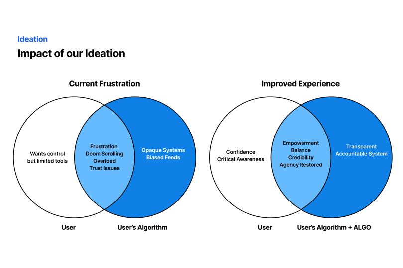
We came to call it Awareness Without Control. Users know the algorithm is curating their reality. They also know a single wrong tap can send the feed in a direction they will spend weeks trying to unwind. The default response is caution, which looks a lot like helplessness.
Our research question: how does limited visibility into algorithmic curation affect the way young people engage with the diversity and reliability of their feeds?
Research
I took the research lead. We needed enough evidence to justify a product direction by Saturday morning, which meant compressing a plan that would normally take weeks into a single block.
We ran an evening survey that reached twenty plus respondents. In parallel I set up speed interview stations at the venue itself: chairs pulled together, timer on a phone, one question deep per respondent. Other teams were moving between their tables. We stopped them. By Saturday afternoon we had completed twenty one interviews. We rotated interviewers and note takers every two hours so the empathy did not fade, then ran an affinity map live on stickies.
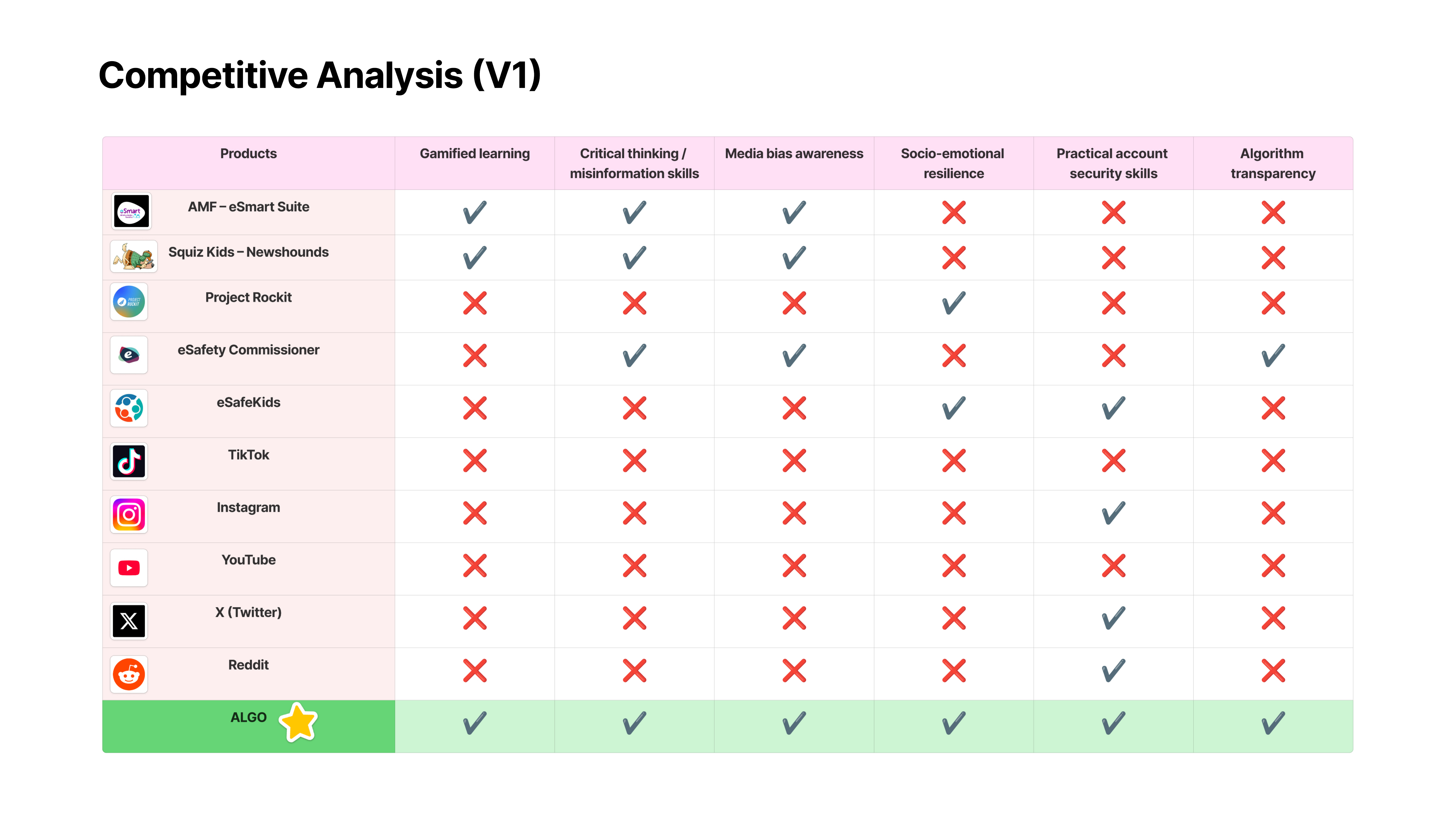
We also scanned what already existed. Australian programmes like AMF eSmart, Squiz Kids Newshounds, Project Rockit, and the eSafety Commissioner all teach young people to evaluate content. None of them teach the system underneath. That was the gap. Algo would not teach Matt to distrust content. It would teach him to see the system deciding what content he got.
Three themes separated cleanly from the affinity map. Awareness Without Control: users know every like feeds the algorithm, but not how to undo it. The feed feels like a room with no light switch. Curiosity for Transparency: almost every interviewee wanted to see how the machine was making decisions, not to fight it, just to understand it. Desire for Balance and Agency: users wanted tools to shift moods and separate entertainment from heavy content, without adding another wellness chore.
I know the algorithm decides what I see, but I don't really get how? Sometimes I just wish I had more control, instead of scrolling past the same kind of posts every day.
Who We Designed For
Matt. Twenty one. Business and Politics student in Melbourne, juggling a casual part time job. He wants to stay informed without feeling overloaded, wants perspectives beyond his bubble, wants quick credibility checks on the content he sees. He scrolls through the same kind of posts every evening. He wants to be empowered. Instead, he feels trapped.
The Pivot
The obvious first move was a feature inside Instagram or TikTok. Less friction. Users already there. Nothing to install.
We killed the idea by Saturday morning. A platform specific tool only exposes one bubble. If Matt wants to understand his whole digital footprint, he needs something that reads across Instagram, TikTok, and whatever comes next. A standalone app gives up the zero friction advantage but earns the right to show him everything.
The tradeoff meant we had to work harder to earn the download: a stronger brand, a trustworthy onboarding flow, a first session that paid off immediately. A better problem to solve than a narrower scope.
Users are curious but fatigued. The best solutions for digital literacy have to deliver empowerment without asking for another chore.
What We Built
Once we had the platform direction, we needed a tone. Wellness language was out. Lecturing language was out. We wanted Matt to feel like the app was giving him a gift, not a grade.
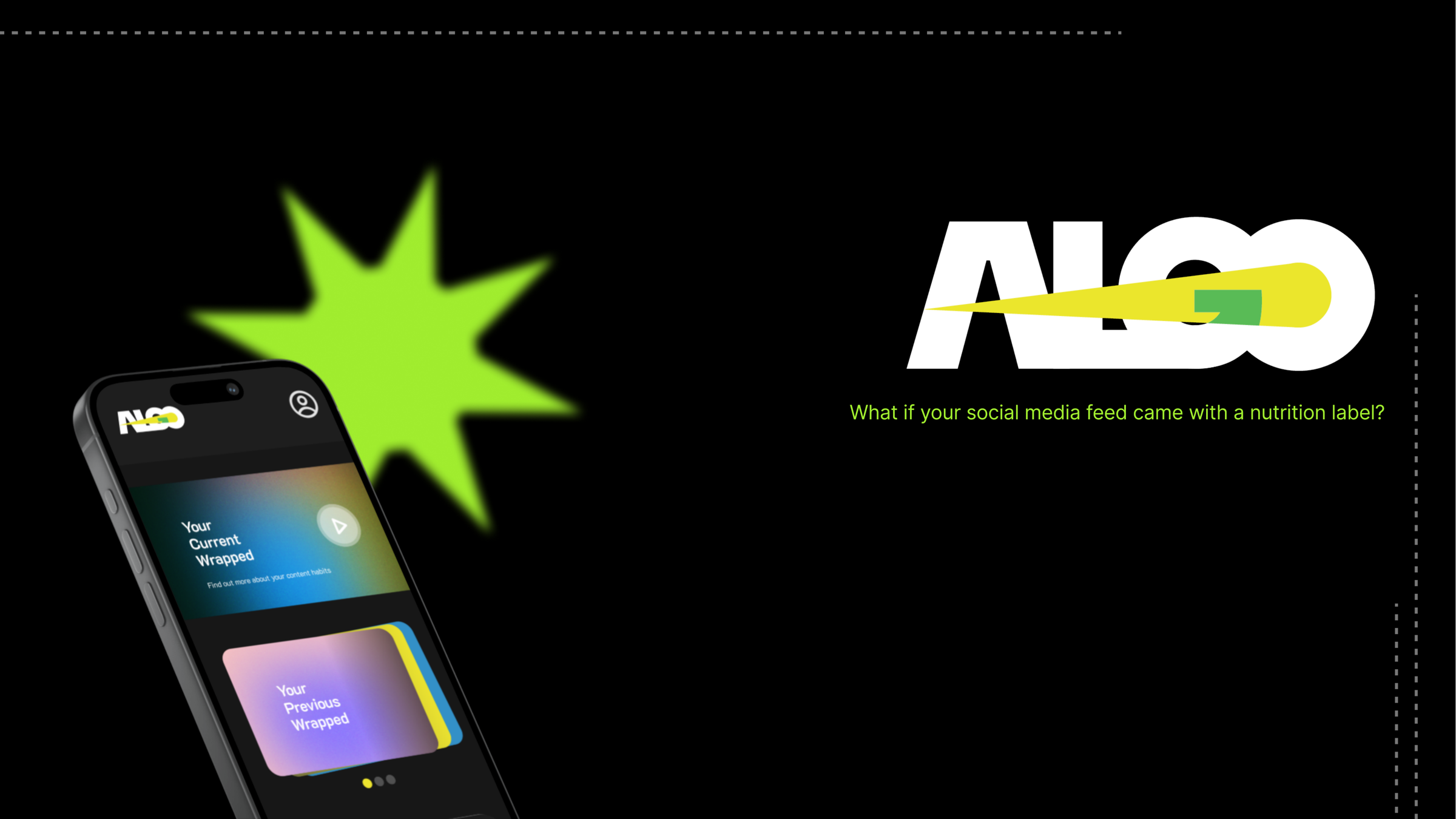
“Spotify Wrapped for your feed” unlocked the rest of the design. Wrapped works because it is playful, visual, shareable, and a little bit flattering. It turns data into a story you actually want to read. We kept the format, shifted the intent: instead of celebrating your taste in music, Algo celebrates and gently complicates your relationship with your own algorithm. The brand followed: a lightning bolt slashed through the wordmark, a dark cosmic palette, mesh gradients closer to music apps than journalism.
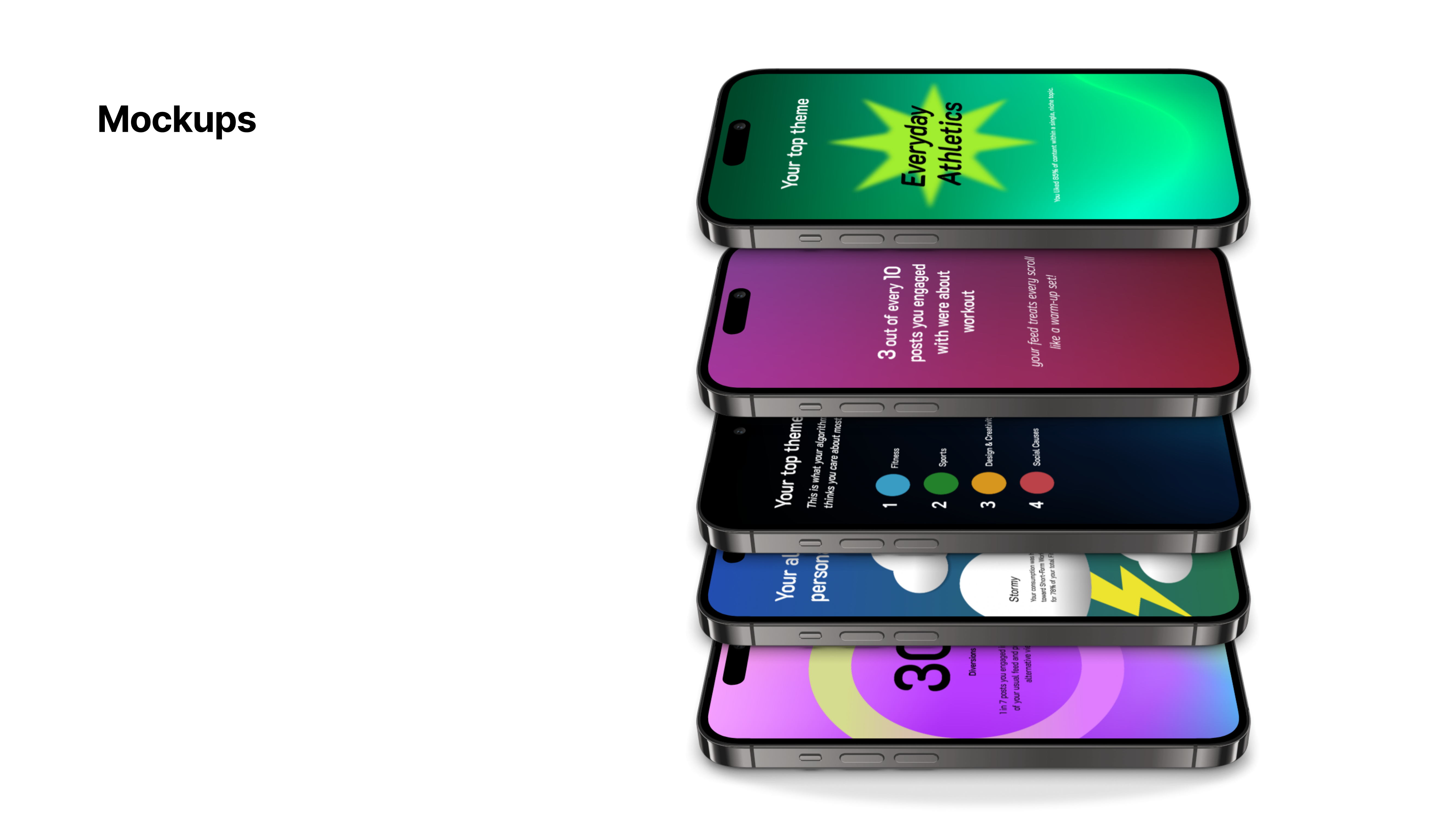
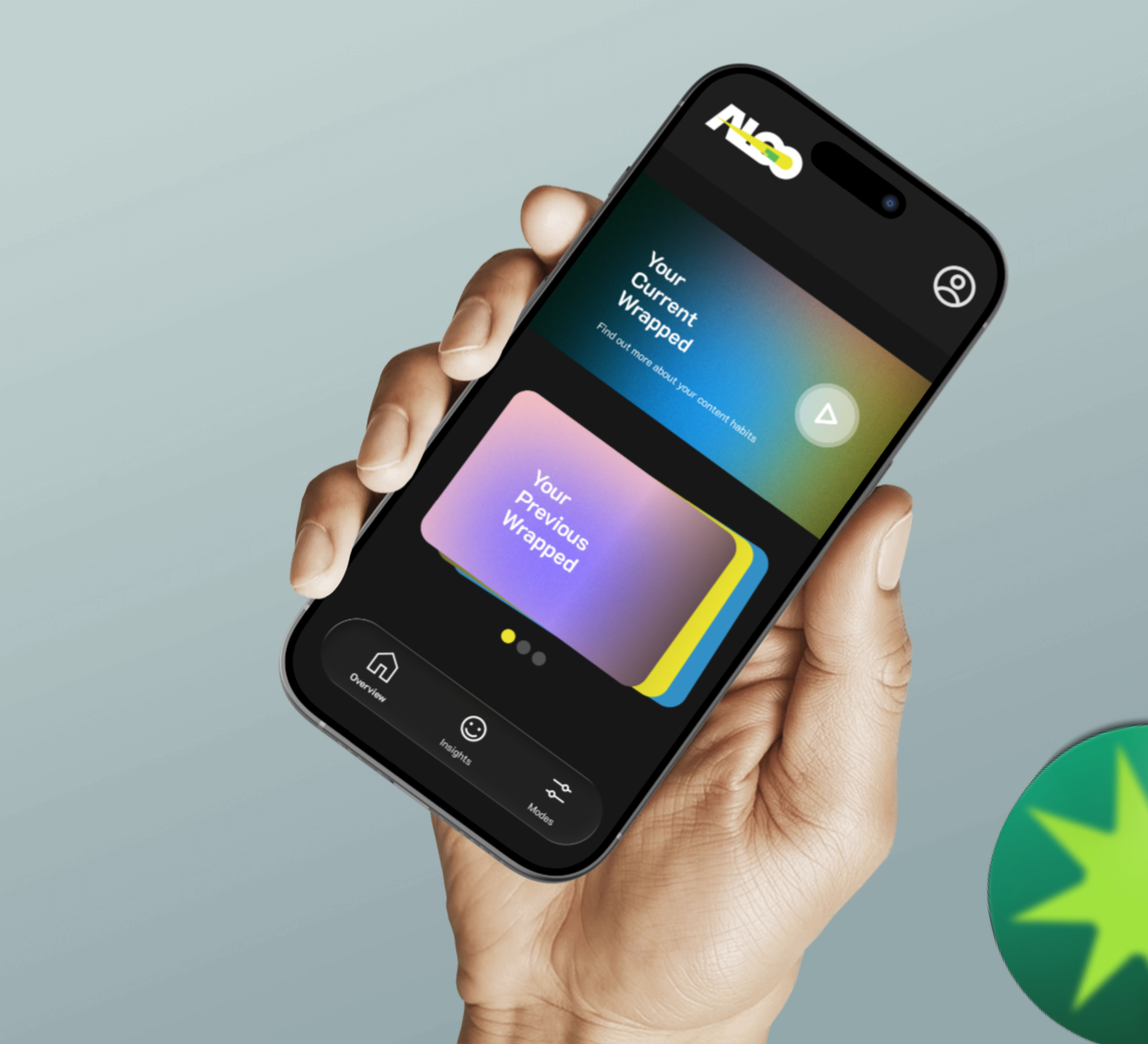
Algo reads a user’s social media activity and turns it into three connected moments. An onboarding flow that earns the download. A dashboard that makes the invisible concrete. A Wrapped story that turns the numbers into something Matt would actually send to a friend.
An onboarding that earns the download
The moment Matt taps Get Started is where the standalone bet either lands or fails. Every detail of the first thirty seconds has to pay back the friction of installing a new app. The opening screen keeps the promise short: one ALGO lightning bolt, one sentence, one primary action. The loading state that follows is deliberately calm. It reassures Matt that his data is being read, not harvested, and the payoff is on its way.
The onboarding is the compensation for the tradeoff we accepted when we killed the integrated feature idea.
A dashboard that answers the question Matt has been asking for years
Matt lands on his Current Wrapped, with previous Wrapped stories stacked below in a carousel, and can switch into Insights at any time. Insights translates the black box into numbers he can read without decoding: posts analysed, average engagement, a Diversity Score honest about how narrow the feed has become, a Filter Bubble label that does not hide behind jargon. A bubble chart shows which topics take the largest share. Every stat has a plain English one liner underneath it.
The dashboard is the reparation for the black box. Built to make the invisible concrete before it asks Matt to act.
A Wrapped that turns the dashboard into a story
The signature moment. Algo compresses a month of algorithmic behaviour into a six card story that feels closer to a year in review than a dashboard. The opener reads Ready? Your digital self just sent you a report. From there the story walks Matt through his most engaged topic, the share of his feed that lived inside a single niche, the split of short form versus long form, and a personality verdict with weather iconography. Every card is share ready. Every stat is phrased in plain English. The final page is an invitation to do something about it, not a guilt trip.
Wrapped turns the dashboard into a story. The part people actually send to friends. The distribution engine underneath the product.
Prototype walkthrough. Onboarding, dashboard, and the six card Wrapped story in motion.
What I Contributed
Research. I led it from scope to synthesis. Wrote the survey and interview script, set up the speed interview format at the venue, facilitated the affinity map, wrote the problem statement and How Might We. Matt came out of that synthesis.
Design. Contributed to the brand, the design system, and the hi fi screens. Collaborated on the Wrapped story template, tuning pacing, pagination, and tone. The insights visualisation and bubble chart were a Figma collaboration I helped prototype.
Storytelling. The Spotify Wrapped framing came out of the team. I helped build the narrative arc of the pitch deck and rehearsed the beats so the handoffs felt natural. On Sunday I co presented to the judges.
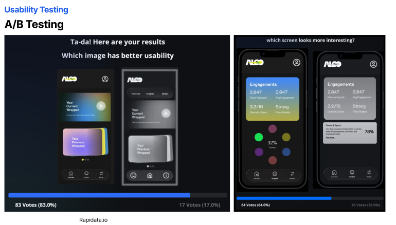
Testing. I ran the A/B tests on Rapidata between the dashboard and insights variants. The colourful versions won by clear margins, which gave us the confidence to lock the screens before the Sunday pitch.
Collaboration. Five people, forty eight hours, one product. I kept the timeline honest: tracked who was blocking whom, kept the scope tight, made sure nobody was soloing a problem at three in the morning.
What I Learned
Three things I am still using.
Users are curious but fatigued. Any solution for digital literacy has to deliver empowerment without adding a chore. If the app feels like homework, the people who need it most will be the first to delete it.
A single strong analogy is worth a week of debate. Spotify Wrapped let us skip a dozen stylistic arguments and get straight to execution. The right reference frame collapses ambiguity faster than any style guide.
Pivoting inside a forty eight hour clock is its own skill. We killed a decent idea on Saturday morning because a better one was asking to exist. Noticing when the second idea is better, and being fast enough to let the first one go.
A note on the polish. Everything here was built in forty eight hours, which is why the UI sits at midfi. Spacing, motion, and type are tuned to read at pitch scale, not ship scale. The peer vote and the Rapidata wins told us the idea is worth more than the clock; the next pass is a production hi fi system tuned for the App Store.